The Richmond Branding and Marketing Study is complete. Click here for The Final Presentation, which is a lengthy summary of how the process evolved and how the work products can be used by multiple organizations for multiple purposes. There are dozens of appendices that include detailed graphics and examples of how the marketing kit can be deployed.
This has been a lengthy and often controversial process that we have been working on since 2015 as an initiative of the Mayor’s Office paid for entirely with private donations of $108,000. There is no City money involved.
Richmond is a diverse city, which we found is perceived one of its major strengths. But we also found that there is a vast diversity of opinions about what Richmond’s “brand” should be, how Richmond should be marketed, to whom it should be marketed and even if it should be marketed at all (one person’s economic development is another person’s gentrification).
This effort was far more than developing a logo and a strapline. The consultant was North Star Destination Strategies, and the first phase included a massive and exhaustive market research effort both inside and outside of Richmond, which was completed at the end of 2015 and presented to the City Council on January 26, 2016. Click on Richmond Research Report, which includes fascinating detail about people’s perceptions of Richmond.
One of the things we learned from North Star is that it is more effective to build a marketing effort on positive perceptions than to try and reverse negative perceptions. Exhaustive market research confirmed that perceptions of Richmond associated with crime (unsafe and dangerous), blight, poverty, industry and poorly performing schools are persistent whether or not we agree. On the other hand, there are strong positive perceptions about Richmond’s waterfront location, Rosie the Riveter WWII Home Front National Historical Park and the Bay Trail, as well as its central Bay Area location, diversity, affordability, transportation options and development opportunities. Of those outside Richmond who were queried, diversity, affordability and accessibility were among the strongest positive perceptions.
Positive perceptions, such as “affordability” and “diversity” are difficult to portray graphically because of their intangibility. On the other hand, reinforcing Richmond’s image as a waterfront city has no graphic limitations, and it results in strong positive associations as well as being historically accurate.
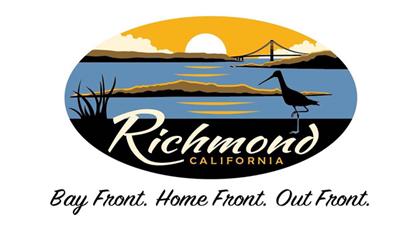
A marketing strapline is intended to summarize what a brand stands for in just a few words. It doesn’t have to be descriptive (although some are, like eBay’s “The world’s online market place”), but it should support a brand’s positioning and communicate what the subject is about. The first two statements in the strapline Bay Front. Home Front. Out Front, are obvious, but the third, “Out Front,” is more subtle. It references Richmond’s recent initiatives and leadership in sustainability, health, social justice and government (such as community policing).
North Star concluded its market research phase with the following Brand Platform Rationale that summarized the positive perceptions about Richmond.
For people seeking a Bay Area existence without being cramped or crushed by cost, Richmond offers some of the most affordable housing in the Bay Area particularly in a city with a waterfront.
•The city also has prized sites and buildings sought after by business and industry.
•Although unknown to some there are great parks and open space in Richmond.
•There is less density in Richmond than other parts of the Bay Area.
•Homeownership is still attainable in Richmond.
•Convenient access to all of the Bay Area with BART and the future ferry will expand that reach and convenience.
Richmond, with the most miles of shoreline along the East Bay,
•Many do not associate Richmond with the waterfront but should.
•This key asset allows Richmond to feature all of its beauty throughout the community.
•It demonstrates the industrial access of the port and transportation assets.
•Richmond has more miles of the Bay Trail finished than most and boasts one of the best if not the best dog park in the Bay Area.
•People love being along the water and associate a particular vibe to that.
Richmond is a diverse community with a steel resolve
•Richmond is home to diverse cultures and ethnicities. A distinction that some Bay Area communities are losing or at least diluting.
•There is great diversity in the philanthropic pursuits here as many lead in reforms for social issues affecting many communities.
•Many companies are discovering the advantages of the business environment, access to space, and hardworking workforce in Richmond.
•Richmond’s rich history is about hard work, sacrifice, and global impact. Rosie and shipbuilding are figuratively and literally about steel resolve.
•That resolve is present today in how Richmond approaches challenges and growth. Tackling difficult issues in unconventional ways to achieve great results. And that extends to the great ideas in the business community on how to create and deliver products.
•Steel resolve is believable today because of your past history. It lets you claim that strength and personality and makes it relevant to today
As you can see the initial Brand Platform Rationale is important for its content, not necessarily the poetry of its narrative. So North Star distilled the Brand Platform Rationale to a simple sentence, called the Brand Platform that is intended to include the most compelling description of Richmond’s brand.
North Star Suggested Brand Platform for Richmond
For people seeking a Bay Area existence without being cramped or crushed by cost, Richmond, with the most miles of shoreline along the East Bay, is a diverse community with a steel resolve so great ideas are fulfilled on the home front of the next greatest generation
Finally, North Star suggested the following strapline:
Bay Front. Home Front. Out Front
I like the strapline, but frankly, I find the Brand Platform statement a little clunky, a little cheesy and not very descriptive. Everywhere I go, I need to explain Richmond to people, and I use some variation of the following “elevator speech.” (An elevator speech is a clear, brief message or “commercial.” It communicates who you are, what you're looking for and how you can benefit the listener. It's typically about 30 seconds, the time it takes people to ride from the top to the bottom of a building in an elevator).
Tom Butt Richmond Elevator Speech
Richmond is a historic waterfront city on San Francisco Bay, about five miles north of Berkeley, with a population of 110,000. Businesses and residents are attracted to Richmond because of its cultural and ethnic diversity, affordability, climate, central location in the Bay Area and access to multi-model transportation. Richmond has more miles of shoreline and more miles of Bay Trail than any other city on San Francisco Bay. It is the home of Rosie the Riveter WWII Home Front National Historical Park and still has the “We can do it” brashness of its wartime shipyard workers.
Whether or not the City of Richmond will actually adopt the logo designed by North Star is unknown. The current logo, shown below, was adopted by the City Council in 1977.
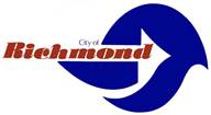
Interestingly, like the new logo, it is focused on images suggestive of Richmond’s waterfront. From the City Council Minutes, June 20, 1977 (Resolution 132-77). Unlike the proposed new one, it requires a supplementary explanation to decipher the symbolism.
"A proposed resolution adopting and authorizing use of Richmond logo letterhead designs was presented. (A new logo is proposed for the City which expresses through color and form, the maritime future of the City). Councilman Greco, Chairman of the Programs and Planning Committee, reported that his committee reviewed the matter and recommended approval and made a motion, seconded by Councilman Grydyk that the recommendation be accepted. On request of Councilman Corcoran, Lance Burris, Economic Development and Renewal Administrator of the Redevelopment Agency, displayed the logo and explained its meaning as follows:
1) The form approximates the shape of the Pacific Ocean.
2) The arrow shape indicates the thrust into the pacific of the port Development. The line used in the letterhead indicates rail support to the Port Activity.
3) The point of the arrow approximates the shape of a sail boat, with a wake trailing behind.
4) The blue symbolizes the maritime future of the City and the red brick the color of City Hall and new construction.
5) The three shapes making up the basic form include a hill shape (Hilltop), a boat hull shape (The Harbour), and an “S” shape for the City’s regional service activities (Downtown).
There being no further comments, the motion passed and Resolution 132-77 was adopted by the unanimous vote of the Council."
Instead of a strapline, Richmond currently uses the motto, or nickname, “City of Pride and Purpose.” Some people really like this, but to others It is so generic that it is meaningless. It says nothing distinctive about Richmond. Every city has a slogan, motto, nickname or strapline, and so should Richmond. Click here for a comprehensive list of city slogans, mottos, nicknames and straplines.
The origin of the motto, “City of Pride and Purpose,” is obscure. People struggle to discern its meaning. Pride, being one of the seven deadly sins, doesn’t seem to be a good start for a motto. And as for purpose – what purpose?
In any event, the work is done, and the extensive work product is out there. What we do with it remains to be seen, but you can look for it on my business cards and baseball caps.