|
| Study compares carbon footprints of Bay Area communities
By Kevin Schultz
January 6, 2016 Updated: January 6, 2016 5:17pm

Photo: Justin Sullivan, Getty
Stanford scored a lower carbon footprint because the unincorporated community has a high population of college students with lower household incomes, more compact housing and more sustainable transportation practices.
Stanford and Atherton are just 3 miles down the road from each other on the Peninsula, but one of them has one of the lowest carbon footprints in the Bay Area while the other grabs the title for having the region’s highest carbon footprint.
The tony town of Atherton, according to researchers at UC Berkeley and the Bay Area Air Quality Management District, consumes nearly three times as many carbons per household as Stanford.
Researchers for the study, which was published online Wednesday by UC’s CoolClimate Network and the air quality district, ranked each census block in the nine-county Bay Area according to its carbon consumption, as part of a greenhouse-gas inventory to detail how the region contributes to global climate change.
The per-household measurements were based primarily on transportation use, food consumption, goods and services used as well as the amount of energy it takes to heat or cool a home, materials that go into home construction, electricity use and waste.
Christopher Jones, program director of the CoolClimate Network and co-author of the study, said Atherton had the largest carbon footprint because of factors such as having larger homes and household sizes, a larger number of cars owned, in general, and longer average driving distances.
More urbanized areas, on the other hand, tended to have lower carbon footprints because of their denser infill housing, accessibility to public transportation, and fewer costs associated with household heating and cooling and goods to fill the home, he said.
Stanford, in particular, scored a lower carbon footprint, Jones said, because the unincorporated community has a high population of college students with lower household incomes, more compact housing and more sustainable transportation practices.
“One of the things that really struck me the most was the wide variation within cities,” Jones said. “Oakland, for example, has some of the highest and lowest carbon footprints in the entire Bay Area, all within the same city.”
He also noted that a more densely populated urbanized area may be contributing more carbon despite having a smaller carbon footprint per household.
Atherton, he said, with its large carbon footprint per household and relatively low population, has a much smaller carbon footprint overall than a city such as San Francisco or Oakland.
The ideal situation, he said, is an area with low carbon footprint per household and high population.
“Oakland is a good example of a low-carbon city,” he said. “It has a low-carbon footprint with a high population.”
He said what the study shows is that people who live in suburban areas need to take a deeper look at the way they live.
For example, some suburban areas are ideal for driving more electric vehicles and using electric heating rather than gas, he said, which contributes to a smaller carbon footprint.
“There is just a real opportunity here for individuals and cities to become empowered to engage the community on this issue,” Jones said.
“The data will allow cities to understand the issues they face.”
Jones said the study was the first of its kind on such a detailed level for a major metropolitan area.
Kevin Schultz is a San Francisco Chronicle staff writer. E-mail: kschultz@sfchronicle.com Twitter: @KevinEdSchultz
Largest Bay Area carbon
footprint per household
Community |
Tons* |
Atherton |
85.7 |
Piedmont |
75.9 |
Alamo |
72.4 |
Ross |
69.2 |
Portola Valley |
68.0 |
Smallest Bay Area carbon footprint per household
Community |
Tons* |
Emeryville |
30.7 |
Stanford |
3.15 |
Rio Vista |
33.7 |
Richmond |
36.3 |
Oakland |
37.2 |
*Tons of carbon dioxide equivalent
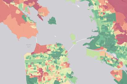
Bay Area’s carbon footprint
This map based on research by UC Berkeley and the Bay Area Air Quality Management District displays average carbon footprints based on household emissions.
New interactive map compares carbon footprints of Bay Area neighborhoods
January 7, 2016 by Robert Sanders
A neighborhood-by-neighborhood inventory of carbon emissions will help households and cities compare and ideally lower their carbon footprints.
The Paris climate summit ended last year with landmark national commitments for greenhouse gas reductions, but much of the hard work of reducing emissions will fall on cities to change their residents' behavior.
To do that, cities need data on current carbon emissions, and a new map of neighborhood-by-neighborhood carbon consumption in the San Francisco Bay Area provide this critical information, showing in detail how the region contributes to global climate change.
The first-of-its-kind interactive map was produced by the University of California, Berkeley's CoolClimate Network and the Bay Area Air Quality Management District, and covers census block groups –neighborhoods of several hundred to a few thousand households – in the nine-county area. Neighborhoods with relatively high emissions for any component of their carbon footprints show up as red, while low-emission neighborhoods are green.
"This is the most granular carbon footprint assessment anywhere in the world," said Christopher Jones, the program director of the CoolClimate Network and first author of a study about the Bay Area carbon inventory. "It includes everything: energy use, transportation, food, goods, services, construction, water and waste. No one has compared neighborhoods like this before."
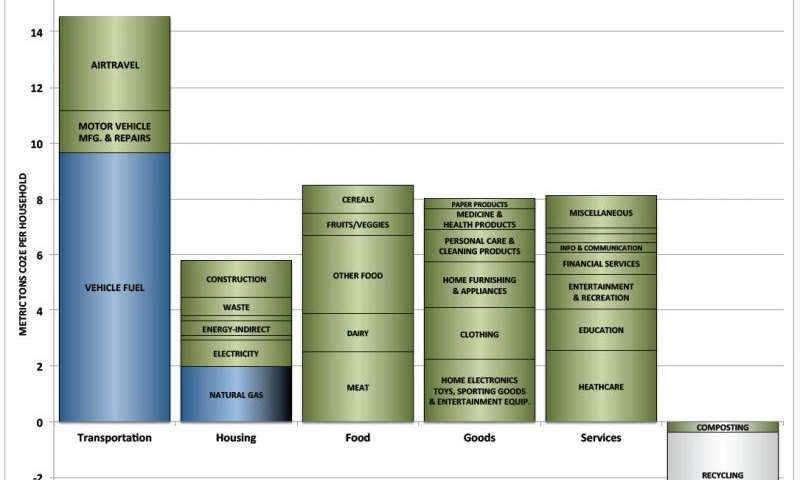
Carbon footprint of typical San Francisco Bay Area household.
UC Berkeley researchers calculated the carbon footprints based on household consumption, regardless of where on the globe emissions occurred, as opposed to more common inventories that only track direct local emissions. For example, if a computer was made in China but purchased by a household in Berkeley, all emissions from the production of the computer are allocated to the household's Berkeley neighborhood.
The new Bay Area inventory is based on a full life-cycle analysis of the emissions generated in the production, use and disposal of each type of product or service. In the case of motor vehicles, the inventory considers the greenhouse gases emitted in the production of all the individual parts that go into the vehicle, vehicle assembly, transporting the vehicle to the dealer, maintenance of the vehicle during its useful life, plus the emissions from refining and burning the fuel used to propel the vehicle.
"The development of a consumption-based greenhouse gas inventory is an important step toward protecting the climate," said Jack Broadbent, executive officer of the air quality district. "It provides the bigger picture of how goods and services consumed by each of us in the Bay Area contribute to climate change and, by extension, highlights opportunities to reduce those emissions."
Bay Area cities shown early versions of the new detailed map were eager for more information, Jones said, a sign that communities are becoming more proactive in altering consumer behavior.
"A large number of sessions at the Paris climate conference were dedicated to actions by cities and local governments," said Daniel Kammen, a co-author, professor of energy and resources and of public policy and director of UC Berkeley's Renewable and Appropriate Energy Laboratory, known as RAEL, where the work was conducted. "Cities really crave this information and we want to make it easier for them to get it."
Consumption map
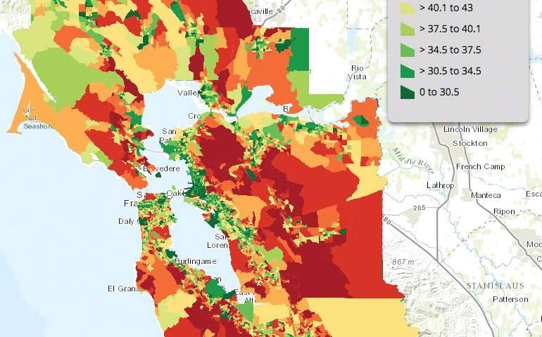
Map of average household carbon footprints in S.F. Bay Area census block groups.
One striking result of the Bay Area inventory, Jones said, is the wide variation in size and composition of household carbon footprints. Some neighborhoods have footprints three or four times larger than others, even within the same city, suggesting the need for highly tailored climate campaigns to change consumer behavior.
Suburban residents, for example, tend to own more cars and larger homes, making them good targets for new low-carbon technology, such as photovoltaics and electric vehicles. Urban areas, on the other hand, tend to have low transportation costs and may best be targeted by campaigns to encourage a less carbon-intensive diet and supporting low-carbon local services.
"For Bay Area households, electricity is a tiny part of the problem, but it's a huge part of the solution," Jones said. "The biggest opportunity we identified to reduce emissions from consumption is to massively scale up electrification of our vehicles and our heating. The total combined potential savings is about 30 percent of the S.F. Bay Area's carbon footprint."
The CoolClimate Network last year published an online, interactive map of carbon footprints by ZIP code for the entire country. The new Bay Area inventory will be used as a pilot project for a statewide inventory by 2016, and could serve as a model for a similar inventory covering the entire U.S.
"As cities start to organize community-scale campaigns to change behavior, these maps become relevant because they can be used to target different neighborhoods depending on, for example, vehicle or electricity or natural gas usage," Jones said.
One example of a city-based approach to lowering greenhouse gas emissions is the Cool California Challenge, a statewide competition between cities to reduce household carbon footprints. The program began as a pilot project by RAEL researchers in collaboration with the Air Resources Board in 2013 and 2014, and is now run by Energy Upgrade California.
The interactive map could also be used to pinpoint the best areas and designs for new housing. "The study really highlights the benefits of urban infill," said Jones. "The size and location of homes affect all aspects of household consumption."
Carbon footprints compared
The study, published online, found that transportation is the largest source of emissions by Bay Area households (33 percent), followed by food (19 percent), goods (18 percent), services (18 percent), heating fuels (5 percent), home construction (3 percent), electricity (2 percent) and waste (1 percent). In some areas, food accounts for over one-third of emissions.
Yet some cities have more than twice the overall carbon footprint of others, and motor vehicles aren't always the largest source of emissions. In some urban cores, like Oakland, food contributes roughly an equivalent amount as vehicles with a lot of variation within the city. In other cities, transportation-related emissions are upward of three times higher than in urban core areas.
Interestingly, this consumption-based approach finds about 35 percent higher greenhouse gas emissions than the traditional territorial approach for the region, largely due to higher emissions from imported food and goods.
"Our goal is to provide high-quality information for the cities and regions that are doing the hard but important work, through encouragement or investments, to reduce their communities' emissions," Jones said.
More information: The paper is available online: escholarship.org/uc/item/2sn7m83z
Provided by: University of California - Berkeley
|
|